
Here at First Past the Poll, one of the most important pieces of advice I reiterate time and time again is — when possible — to look at an average of polls, instead of just one. Last night, how closely one follows that adage was put to the test.
It all started when Monmouth University released its first national poll of the Democratic primary since June. Monmouth is usually considered a top-notch pollster, one of only six to receive an A+ rating from FiveThirtyEight, so new results from such a reputable outlet are always exciting. But this particular poll was one of the most buzzworthy we’ve seen all cycle.
That’s because this was the first survey since April (and the second-ever in the RealClearPolitics database) that has Biden in any place except first. And the response was interesting, to say the least.
Many outlets published the poll as proof of a rapidly tightening race, with Politico, CBS, and The Hill all neglecting to use “average” or “aggregate” in their write-ups.
Interestingly, one party who did take a step back was Biden’s campaign, which issued a response: this poll was simply an outlier, and it’s best to consider an average of all polls.
Indeed, doing so paints a much more favorable picture for the former vice president:
 Even after taking Monmouth’s newest survey into account, the RealClearPolitics average has Biden at 27%, around 11 points above the rest of the field. While that’s certainly lower than this peak of 40% in May, it’s hard to deny he’s still the frontrunner.
Two polls released soon after reinforce this: last night’s Morning Consult numbers show a stable race since last week, with Biden at 33%; upcoming Economist/YouGov results place him only three points ahead a second-place Sanders, very little movement from earlier this month.
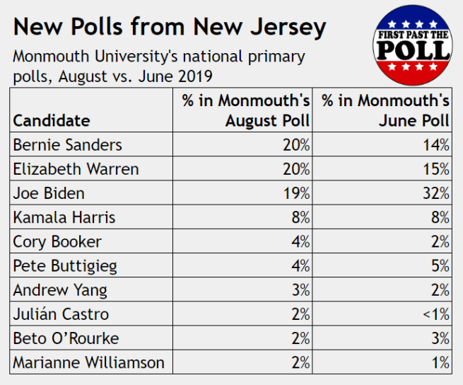
Bearing that in mind, maybe we should take a different lesson from the Monmouth polls. If you refer to the first chart of Monmouth’s June vs. August results, you’ll notice Biden, Sanders, and Warren are in a league of their own, while Kamala Harris has flatlined. All three polls put out yesterday, and most released this month, have made it clear that the junior Senator from California is no longer in the top tier. Her bounce following the first debates has faded.
Still, many are left wondering why Monmouth’s results were so different.
One potential explanation lies in the math: with only 298 respondents, the margin of error for this survey was +/- 5.7%. This alone doesn’t necessarily invalidate or discredit the toplines, but it still has been a common point of attack. Monmouth’s “gold standard” methodology using live telephone callers also diverges from many other pollsters, who have mainly been conducting interviews online.
Another explanation is that Monmouth simply wasn’t afraid to stick to its guns. There’s evidence of many polling firms “herding,” meaning they tend to produce results that fall in line with what others are saying. While this is a practice more common near the end of campaigns, variance and imprecision are inherent to survey research. Thus, outliers like this should be expected, and even if it turns out that Monmouth did miss the mark, good on them for choosing to still release the poll in the form they did.
And the honest practice doesn’t stop there — yesterday, Monmouth Poll’s Twitter account shared a Vox article urging us to “wait for more polls before concluding the race has dramatically changed.”
And I have to say, I agree.
